How simplifying intent and removing friction increased installs and login rates
Friction at the highest-intent moment.
Context
Background
With StreamElements Sponsorships, content creators promote a game or service to their viewers. When viewers click the creator's link, they land on a page where we verify a few details and let them choose whether to log in with Twitch for recognition and rewards, or continue anonymously.
Goal: Boost user conversion with a focused and simplified landing page
Secondary Goal: Convert users to login with Twitch
Business Goal: A performance-based sponsorship marketplace linking gaming and service advertisers with creators' audiences, built on an event-driven revenue model.
Problem
Dropping off at peak intent
Viewers clicking a creator's sponsorship link were dropping off at the landing page -- the highest-intent moment in the funnel.
I audited the existing page and found multiple friction points:
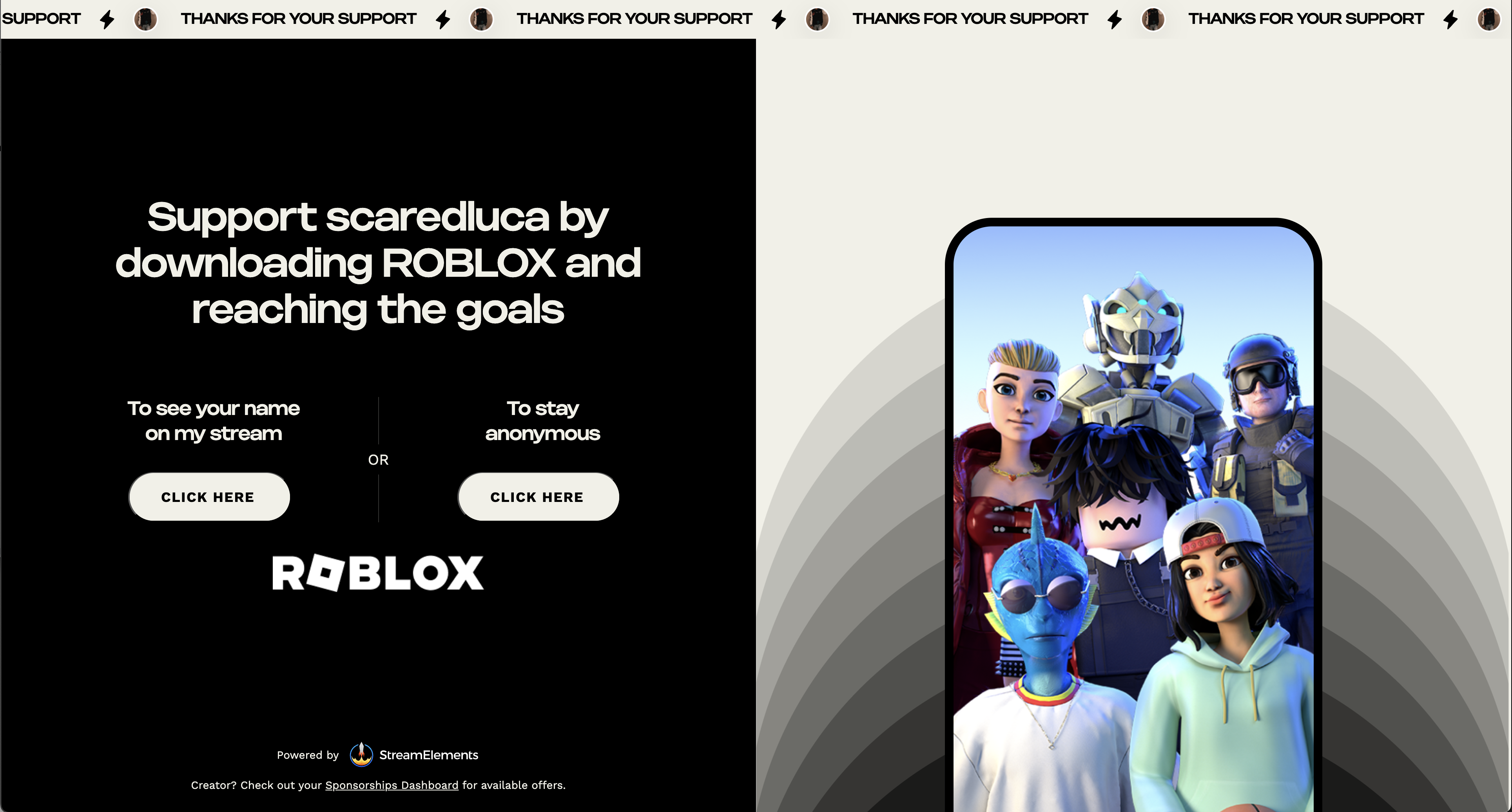
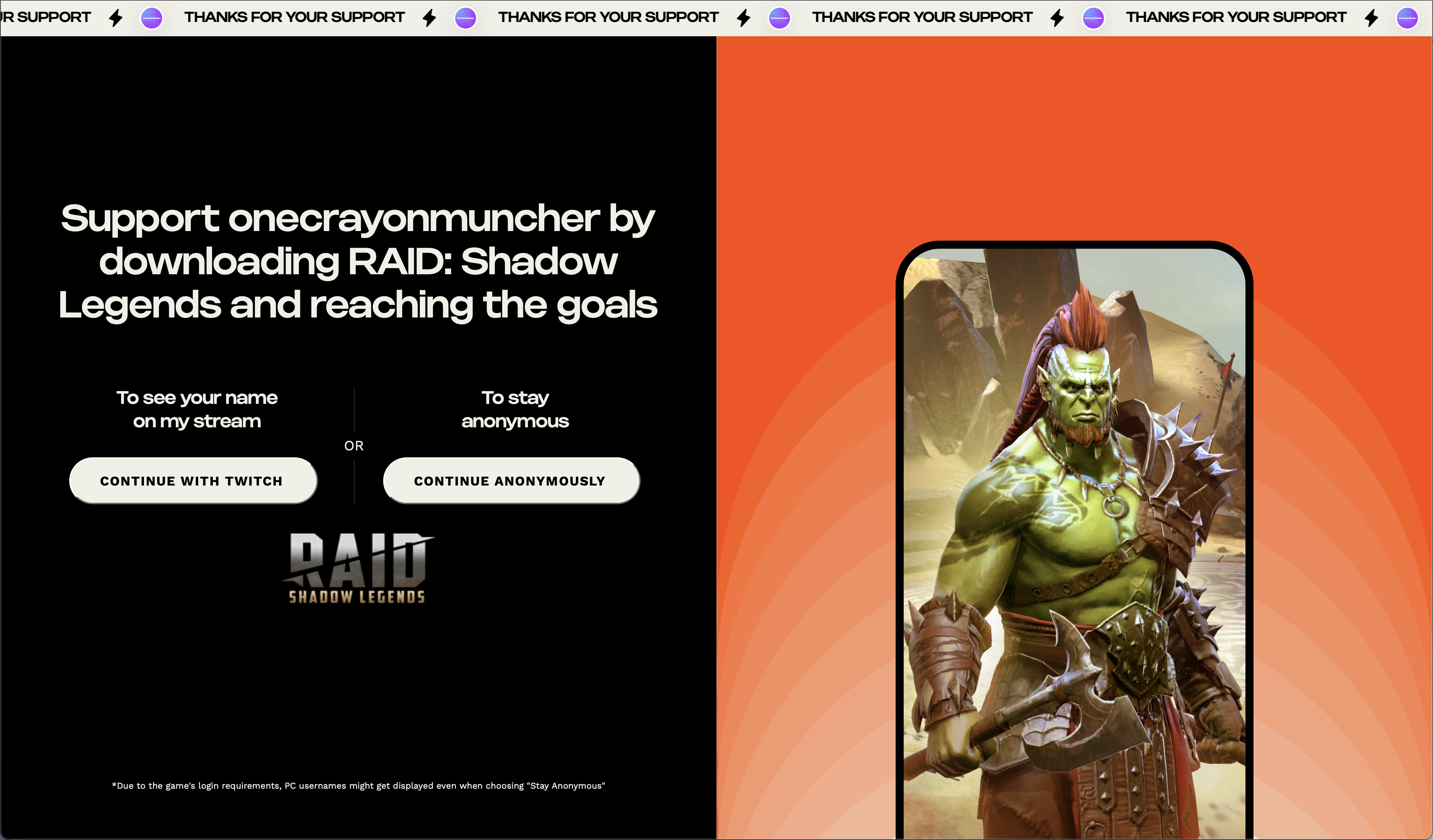
- Two identical CTAs ("click here") creating confusion
- Long headline where the creator's name and value got lost
- No clear reason to log in -- felt like a one-time action with no benefit
- Multiple eligibility checks caused the page to blink and reload, hurting trust
- The page emphasized the game, not the creator the viewer intended to support
The old landing page
Process
How I got there
Reframing around user motivation
Viewers weren't there for the game -- they were there to support their favorite creator. The page needed to reflect that intent, not fight against it.
Simplifying the action
I reduced the flow to a single, clear action. No competing CTAs. One path forward.
The insight: the old page had two equal-weight buttons asking the same thing in different words. Removing the choice paradox was the simplest conversion win.
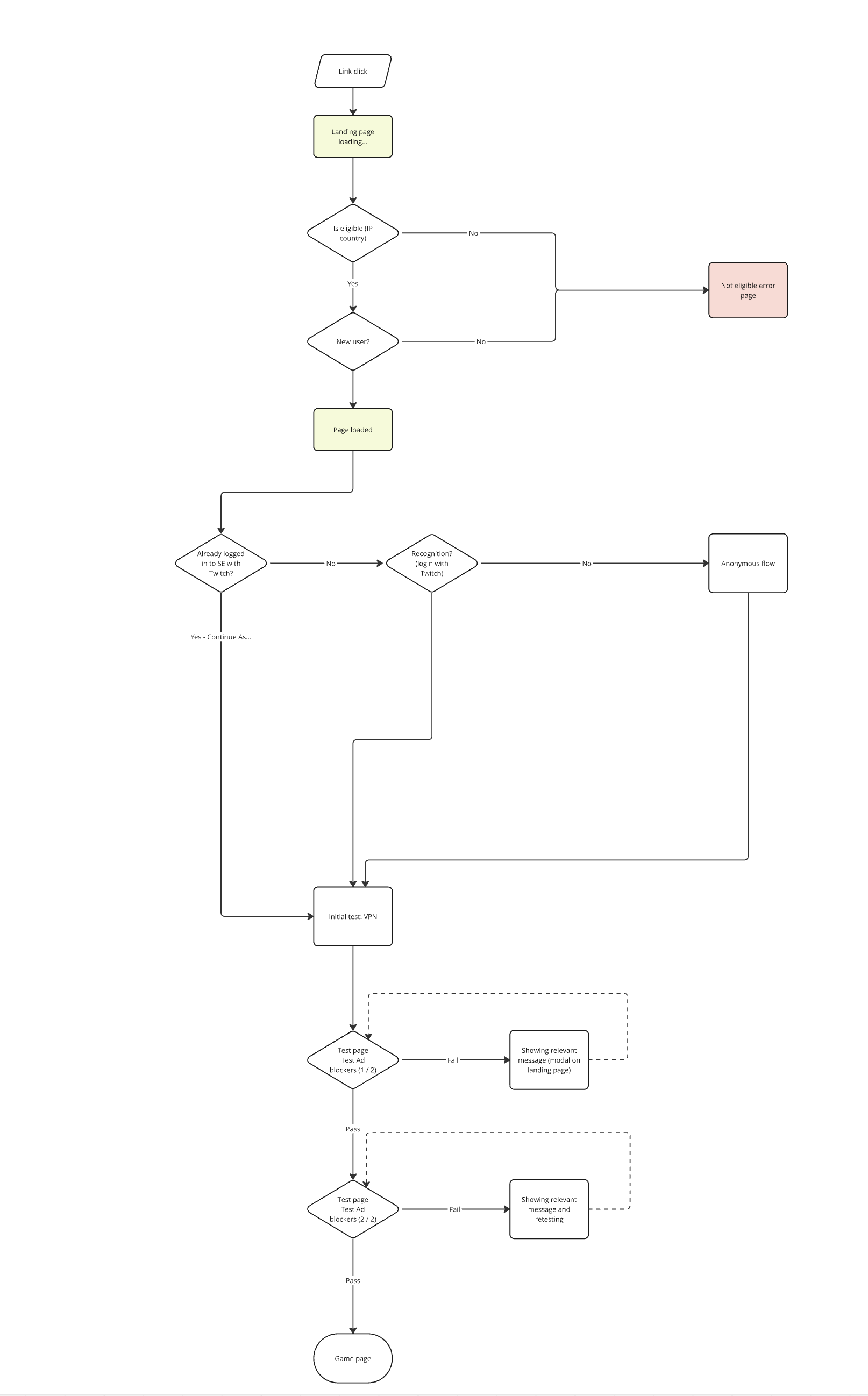
Moving technical work to the background
All eligibility checks were moved to run silently. No more UI flicker, no more page reloads mid-flow. If a viewer was already connected with Twitch, they'd skip the landing page entirely and go straight to the App Store.
Giving a reason to connect
The old page gave no incentive to log in with Twitch. The new page made the value clear: recognition on stream and rewards.
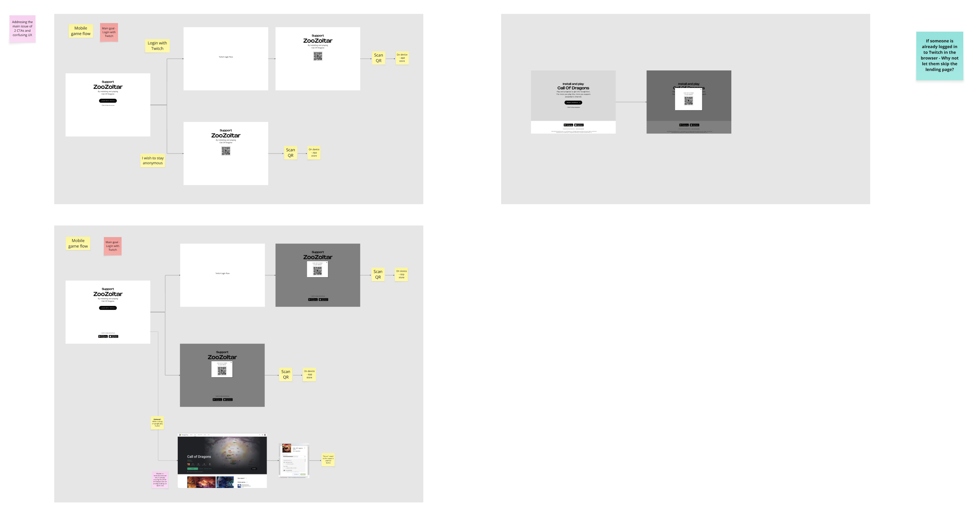
Process: user flow and issue mapping
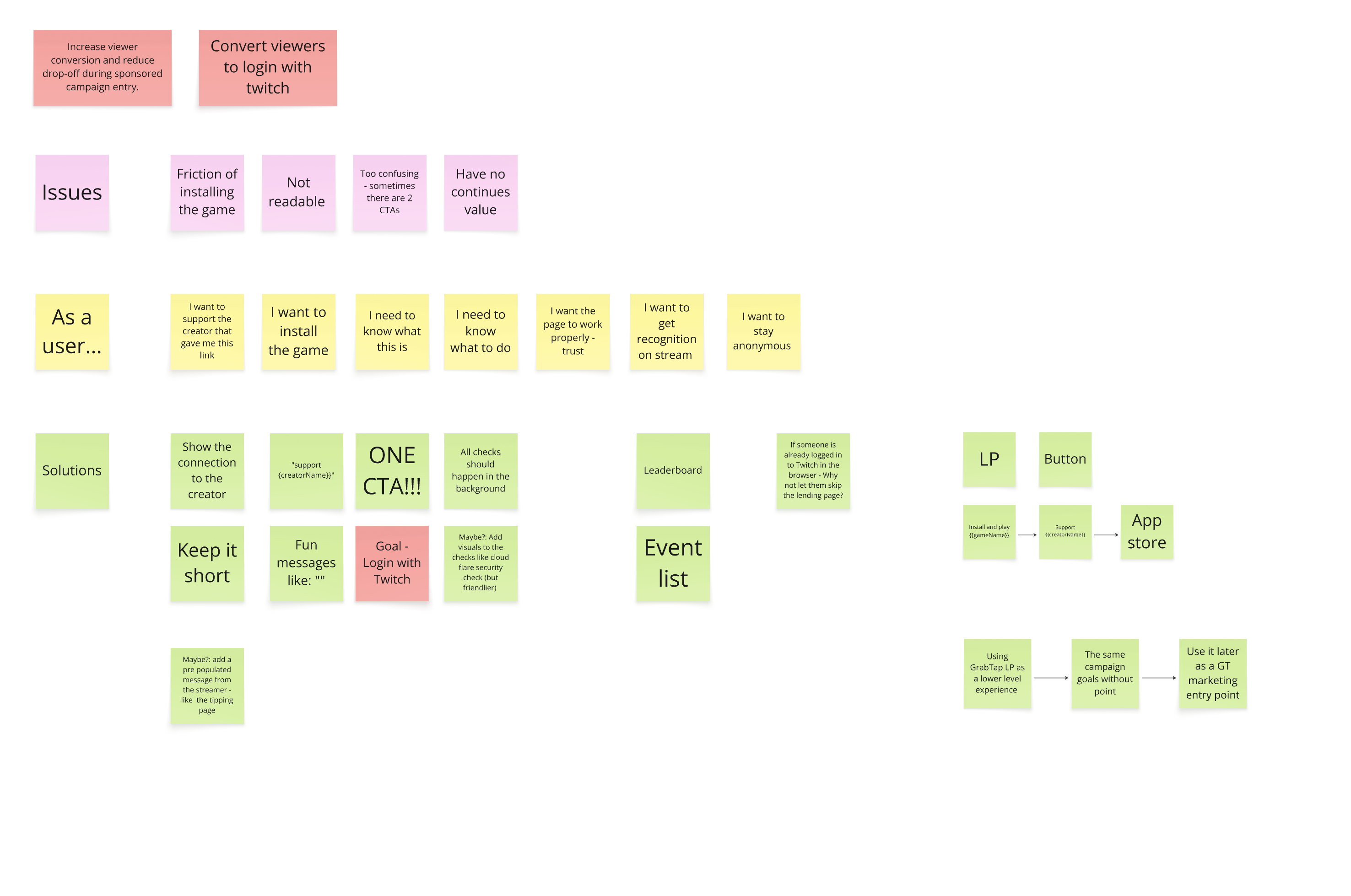
Solution
What We Built
Desktop landing page
- Creator-first messaging: "Play to support [Creator Name]"
- Single primary CTA (Connect with Twitch)
- Clear secondary option (Stay anonymous)
- Clean visual hierarchy
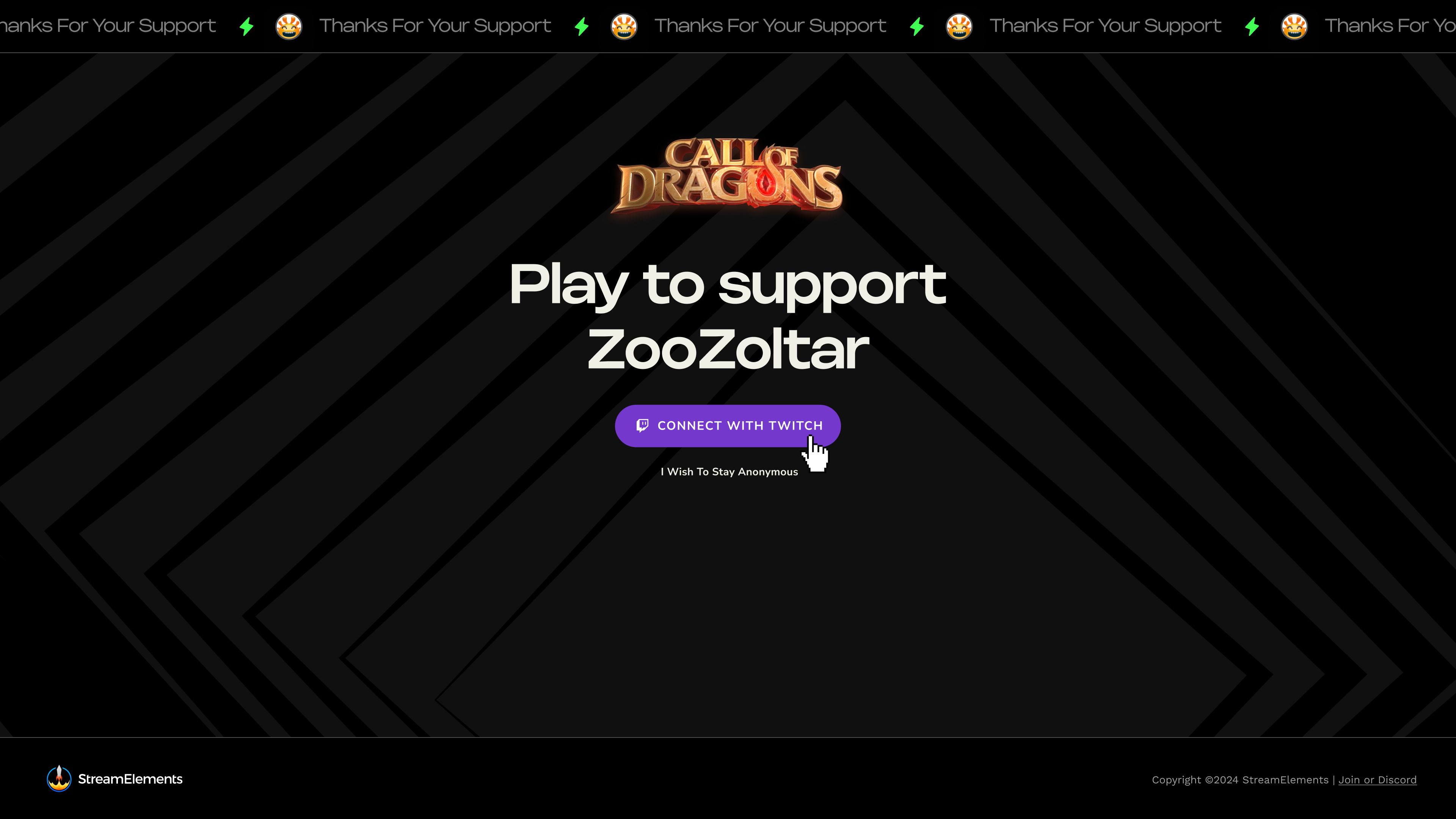
One message, one action. The page now leads with the creator's name and gives a clear reason to connect with Twitch
QR code for mobile installs
For mobile games accessed from desktop, a QR code replaced the traditional download flow.
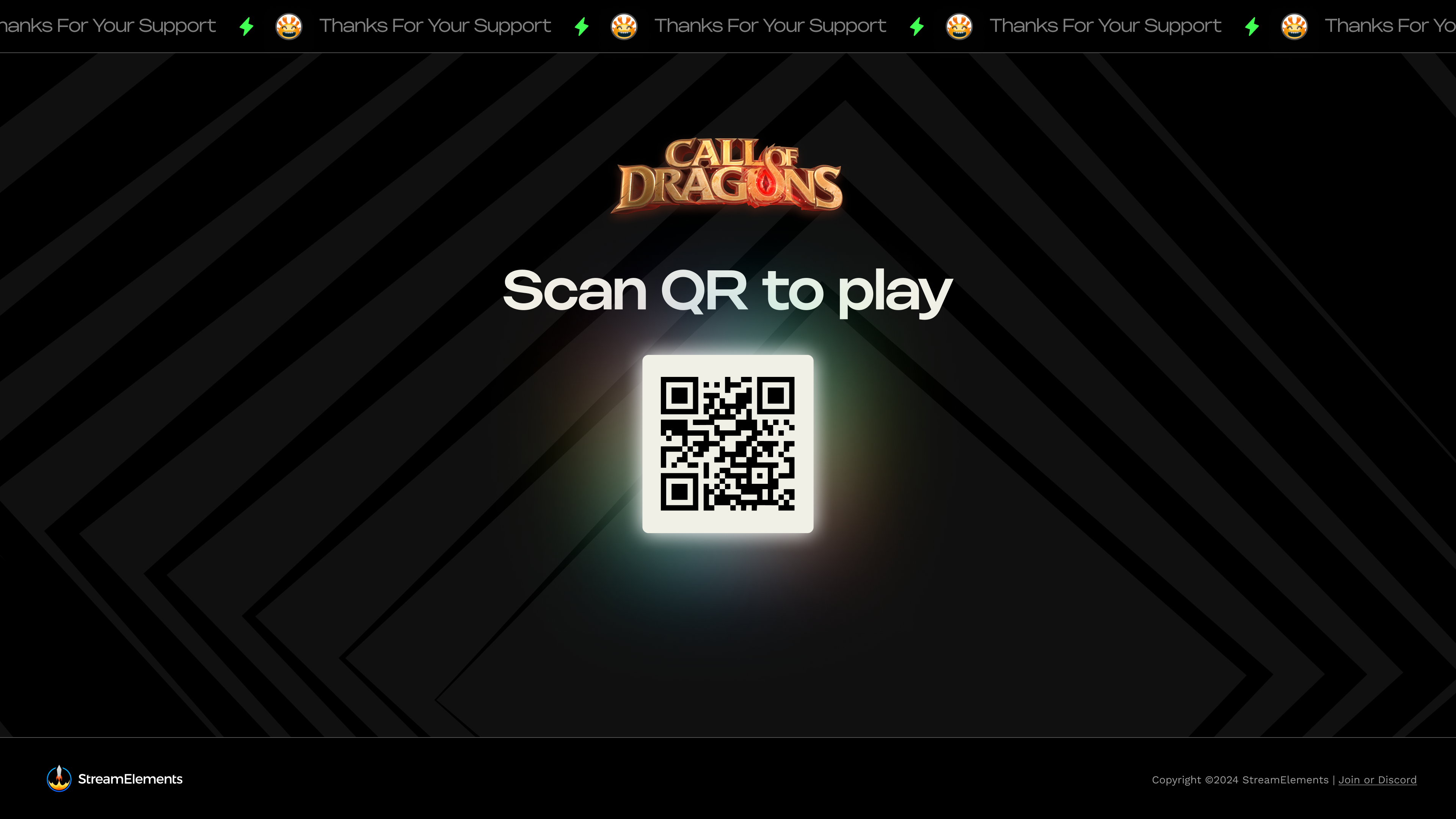
Desktop users playing a mobile game just scan and go. No extra steps, no friction
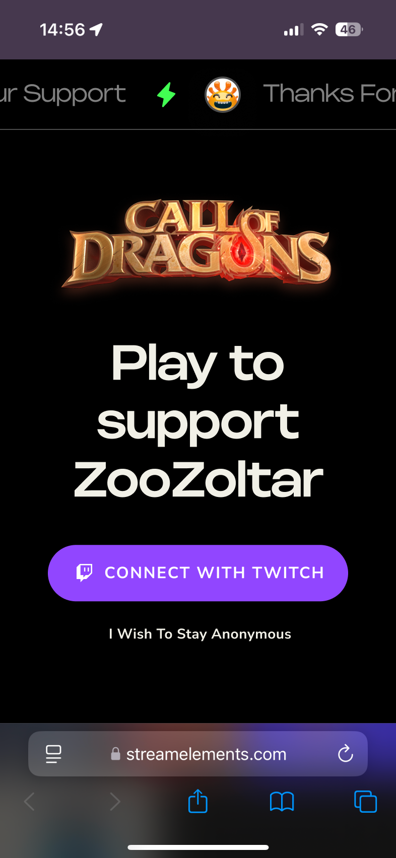
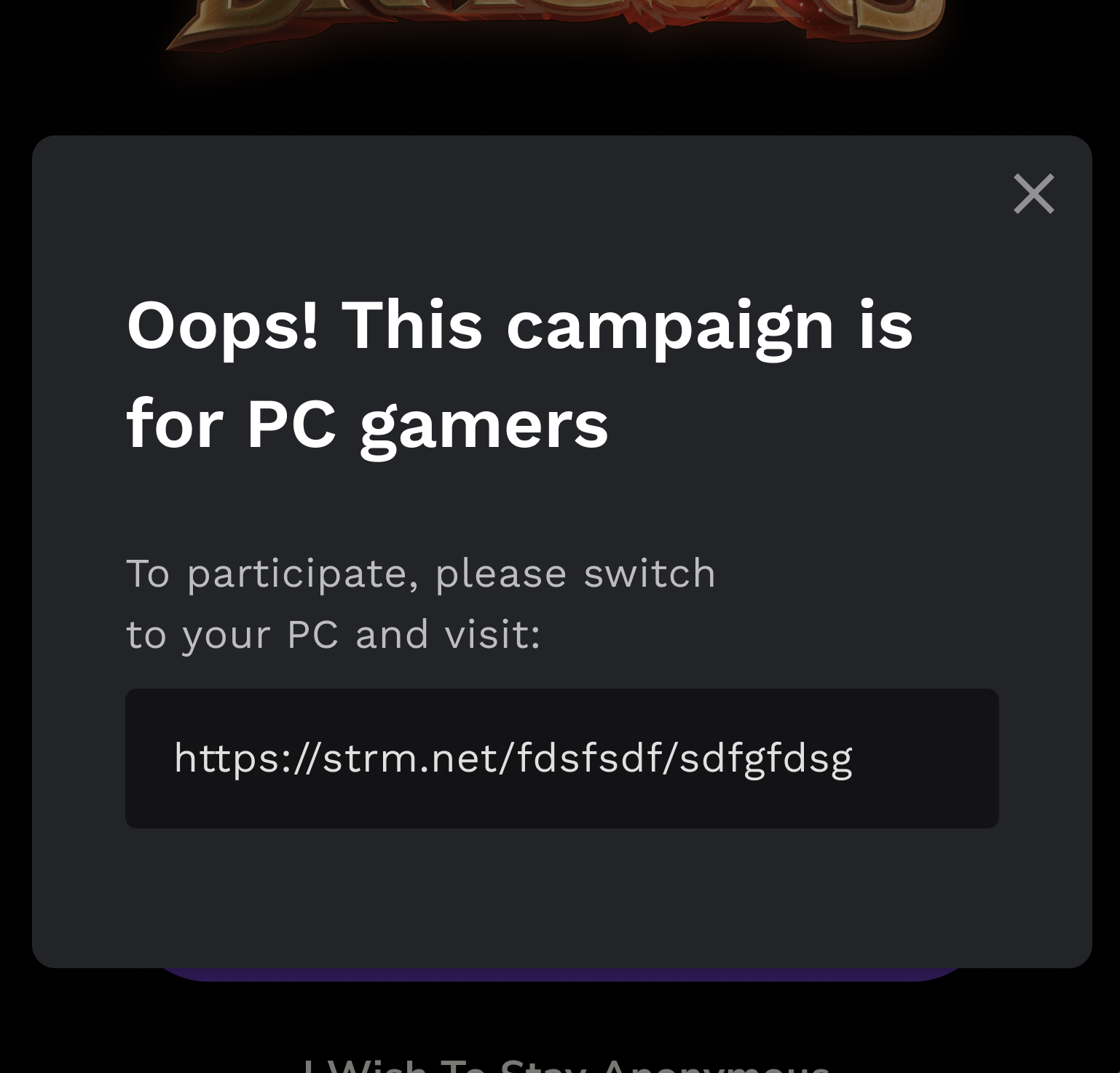
Mobile experience
Edge cases
Graceful handling for ineligible users and smart routing for already-connected viewers.
Results
Impact
Reflection
What I Learned
- Even valuable business steps can hurt conversion if placed at the wrong moment. The eligibility checks were necessary, but showing them to users created hesitation.
- Aligning the flow with user motivation improves results without sacrificing requirements. Focusing on "support your creator" instead of "download this game" converted better while still achieving the business goal.